












ADWORKS/Client Portal/Miller Advisors

Case study · Miller Advisors

A brand system, a website and a robot named Miles.

Miller Advisors helps B2B software companies price what their work is worth. They came to us with a pixelated mark in colors that did not work for them. We redrew the M as a clean vector, gave the brand new colors, a new logotype and a new typeface, and turned it into a system that holds everywhere the brand appears: their website, their inbox, their printer and the AI tools their team now works with.

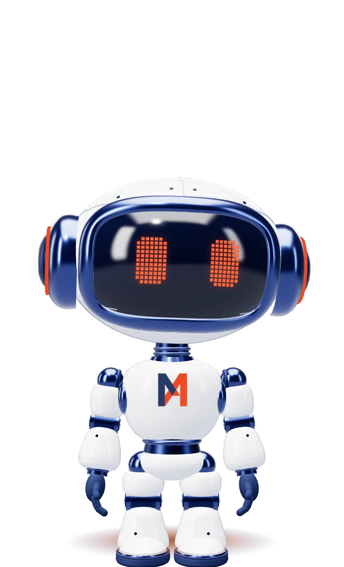
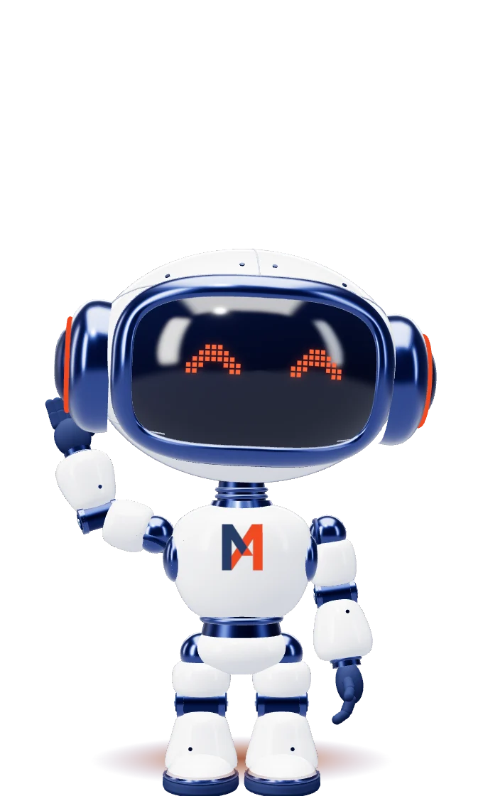
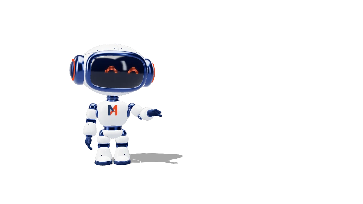
Miles, the Miller Advisors robot, standing
ClientMiller Advisors, Toronto and New York SectorPricing advisory for B2B software We madeRedrawn mark and logotype, color and typeface, brand guidelines, AI brand skill, website, Miles, print, email, client portal Year2026
They had

A verbal identity, a pixelated mark in colors that worked against them, and a growing pile of decks and emails made by whoever was free that afternoon.

They needed

One system that looks the same on every surface, including the ones now being made by AI.

We built

A redrawn mark, new colors, logotype and typeface. Then the rules, the files that carry them, a website, a character, and one place to keep all of it.

01 · Logo system

Redrawn once. Never again.

We redrew the M from a pixelated original into a precise vector, set a new logotype beside it and gave both new colors. Then every version got a job and a background it belongs on: sixteen in all, from the full lockup on light grounds to the monogram, the circle badge and the Advisor icon where space is tight. From here on nobody redraws any of them, and that includes the AI.

Which logo, which background

  • WhiteFull lockup, color
  • PaperFull lockup, color
  • MistFull lockup, color
  • Brand IndigoFull lockup on indigo, no background
  • Deep IndigoFull lockup, white
  • Brand OrangeFull lockup, white on orange
  • PhotographyFull lockup, white

02 · Color and type

Indigo for trust. Orange, once.

Their old colors went. In came a deep indigo and a single orange: sixty percent indigo and white, thirty percent quiet neutrals, ten percent orange. The orange works because it is rare: one word, one button, one spark per view. We chose Raleway as the one typeface, and weight does the work other brands hand to a second font.

Brand Indigo#273B6460 · the foundation
White#FFFFFF30 · space
Near-black#383637
Brand Orange#F0492310 · the accent

Raleway · the only typeface

Hairline display with one heavier phrase.

Section labels, tracked wide

Let’s talk pricing.

03 · Pattern and icons

Built from the M itself.

The pattern is the monogram’s own outline, tiled so it repeats without a seam: tone on tone on indigo, never loud. The eight icons share one grid and two colors, and orange lands only on the part that carries the meaning.

04 · Meet Miles

The guide with a screen for a face.

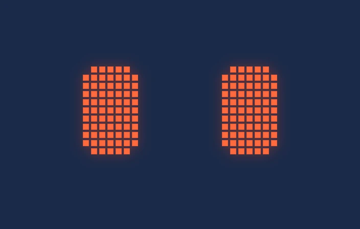
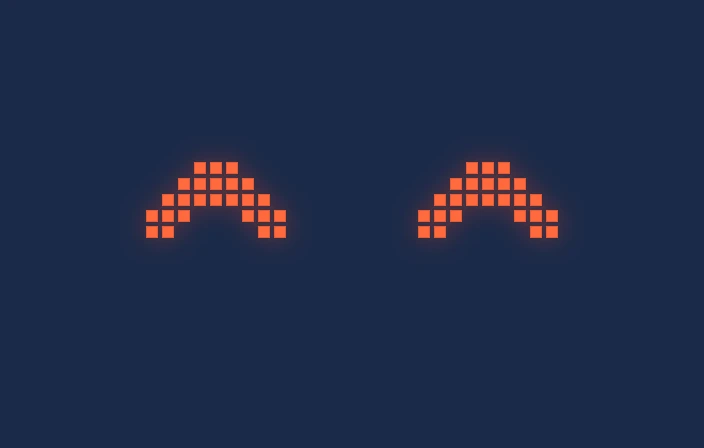
Miles, short for Milestones, will guide Miller’s clients through their pricing portal. The team sent us their first idea of him. We kept his silhouette and his white shell, gave him a glass screen face with pixel eyes and a clearly robotic build, and made him in real 3D for the website. Orange appears in two places only: his eyes and his ears. The M on his chest is the real logo file, never drawn.

Miles, standing
StandingAlways, while in viewBreathes, blinks, and his head and eyes follow the cursor. With no cursor he looks around slowly.
Miles, wave
WaveA few seconds after he first appears, then every 35 to 70 secondsRaises his hand beside his helmet and waves, happy face.
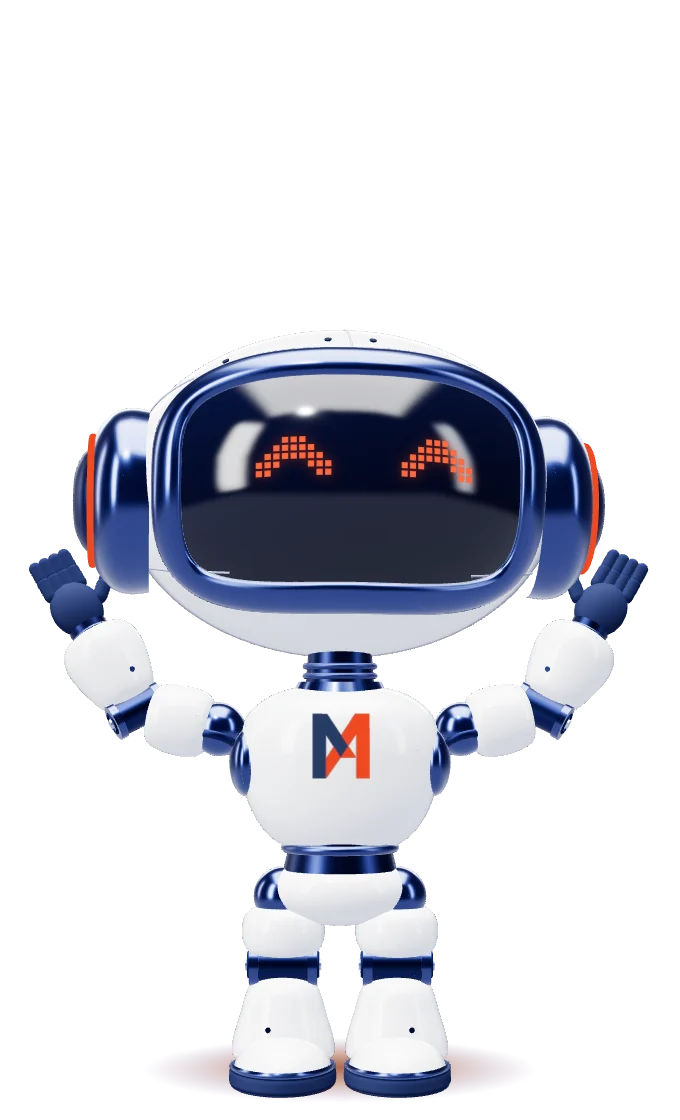
Miles, cheer
CheerWhile the main call to action (Start Here) is hovered or focusedBoth arms up in a V, small hops, happy face. Settles when the cursor leaves.
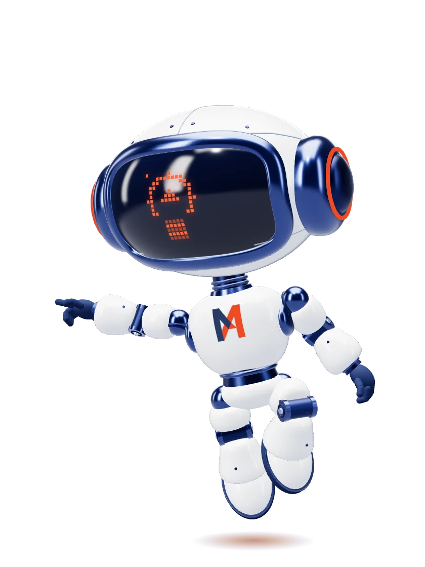
Miles, fly and point
Fly and pointWhile a footer menu link is hovered or focusedShows that page's glyph, lifts off like a superhero until only a sliver of helmet clears his box, leans toward the link and points. A laser runs from his fingertip to the word. His shadow shrinks as he rises; he lands when the cursor leaves.
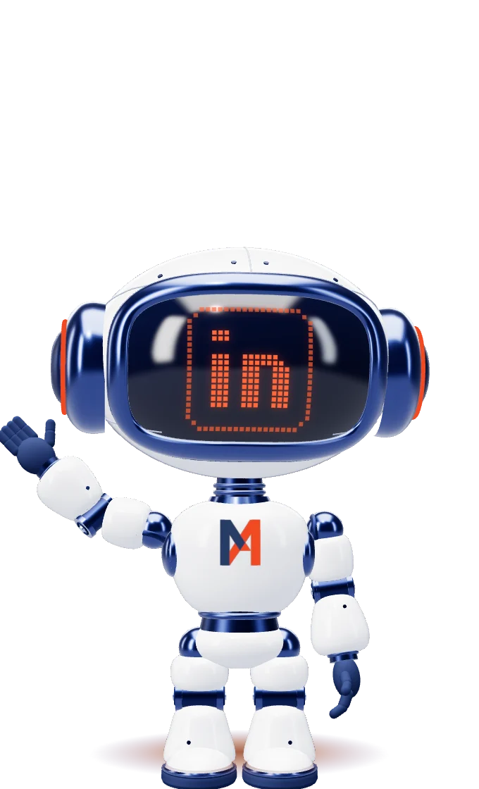
Miles, linkedin wave
LinkedIn waveWhile a LinkedIn link is hovered or focusedShows the 'in' glyph and waves for as long as the link is hovered.
Miles, milestone walk
Milestone walkThe home page section, driven by scrollWalks a line and stops at five milestone rings. At each stop his face shows that tool's glyph and the tool card appears. Phones get the same walk seen from the front.

Seventeen faces, one screen.

Five moods for how he feels, and twelve pixel glyphs for what he is showing you: the five portal tools, every page of the site, and LinkedIn. On the website, hover a footer link and his face turns into that page.

  • Neutral
  • Happy
  • Curious
  • Thinking
  • Proud
  • Competitive monitoring
  • Pricing analytics
  • Plan migration planner
  • Plan migration roll-out
  • Custom research
  • Home
  • Expertise
  • Approach
  • Ideas
  • About
  • Culture
  • LinkedIn

05 · The website

Same pages. A different company.

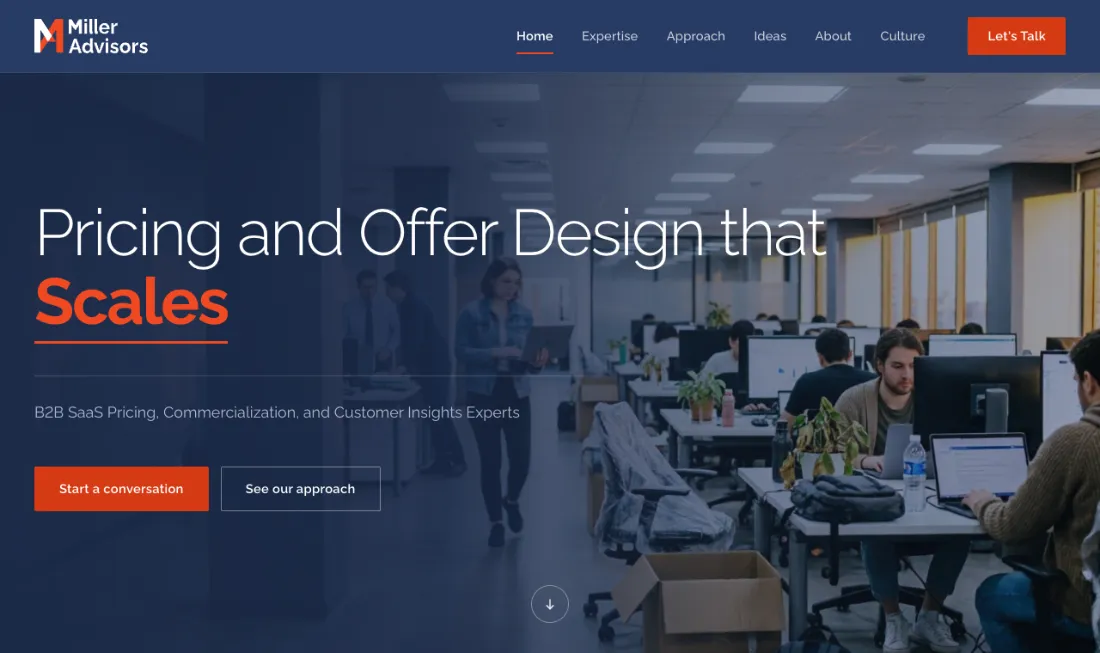
Miller had already built their site. We kept every word, page and menu item and rebuilt how it looks and moves: an indigo header, hairline headlines with one orange word, color-block footers, and photography of today’s software teams under an indigo light.

The Miller Advisors home page: a hairline headline with one orange word over an office photograph
The home hero. One photograph per rotating headline ending.
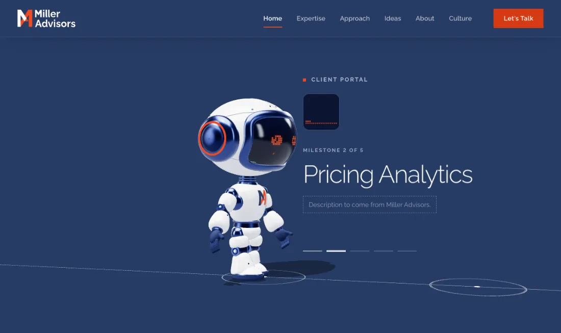
Miles walking the milestone line on the home page
Meet Miles. He walks the line and stops at each portal tool.
The footer: Miles flies and points a laser at the menu link being hovered
Every footer. Hover a link and Miles flies up and points at it.
Delivers Growth
Scales
Captures Value
Drives Upsell
Drives Conversion
Connect

Six photographs, full color under a forty percent indigo multiply. Candid, no suits, nobody looking at the camera. They are generated, so they never appear on the team pages.

06 · Print and email

The small things people keep.

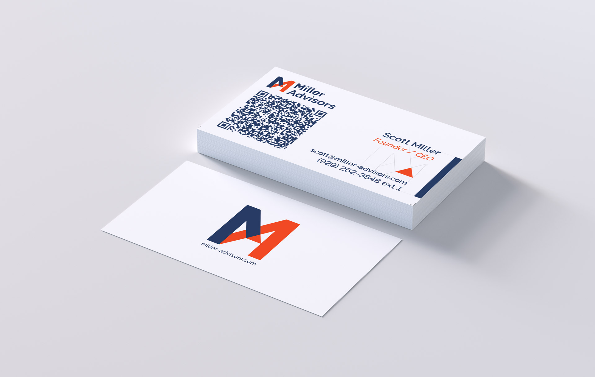
Business cards with a QR code that saves the contact, email signatures for the whole team, newsletters ready for Mailchimp and the company deck on the brand’s deck system. Small pieces, and the ones a client holds in their hand.

Miller Advisors business cards, front and back
Business cards, press ready
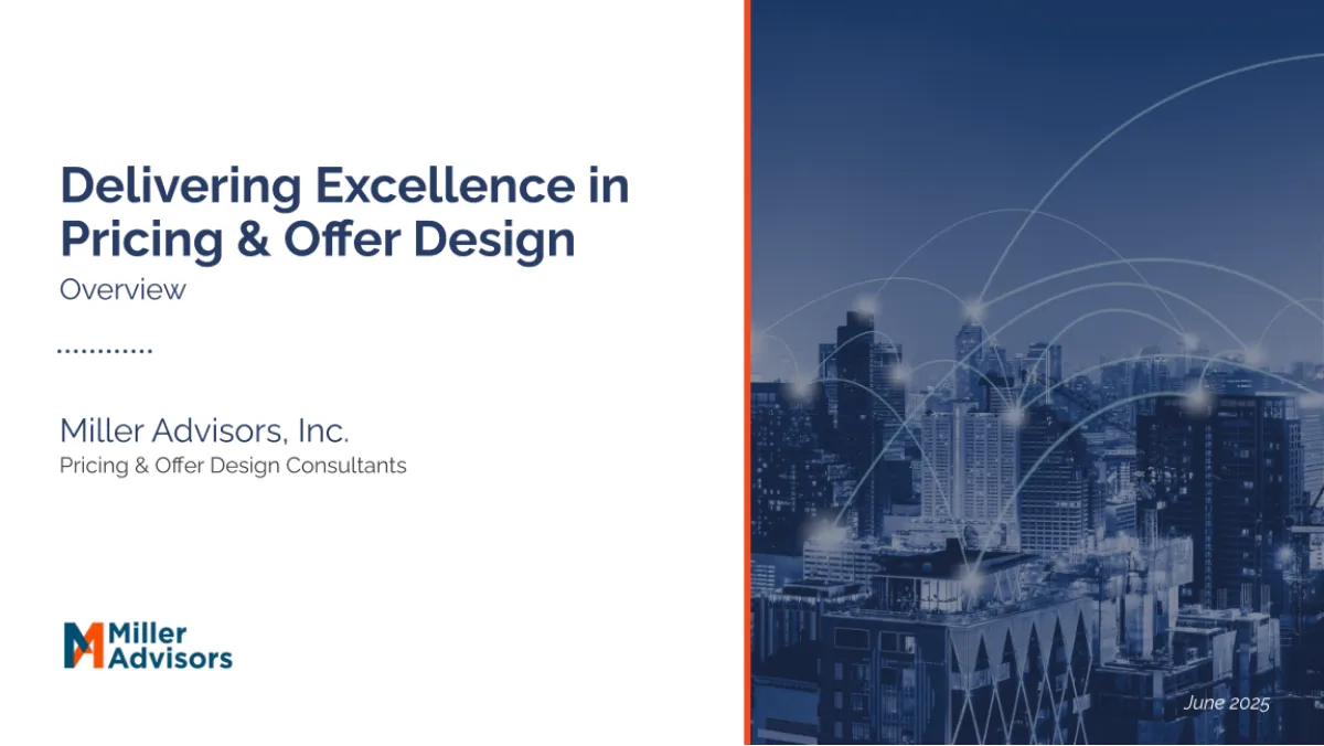
The first slide of the Miller Advisors deck
Company deck
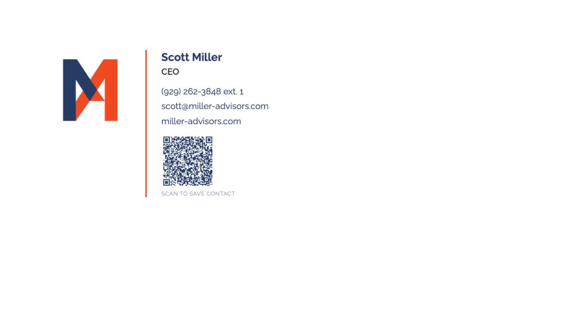
A Miller Advisors email signature with a QR code
Email signatures with QR
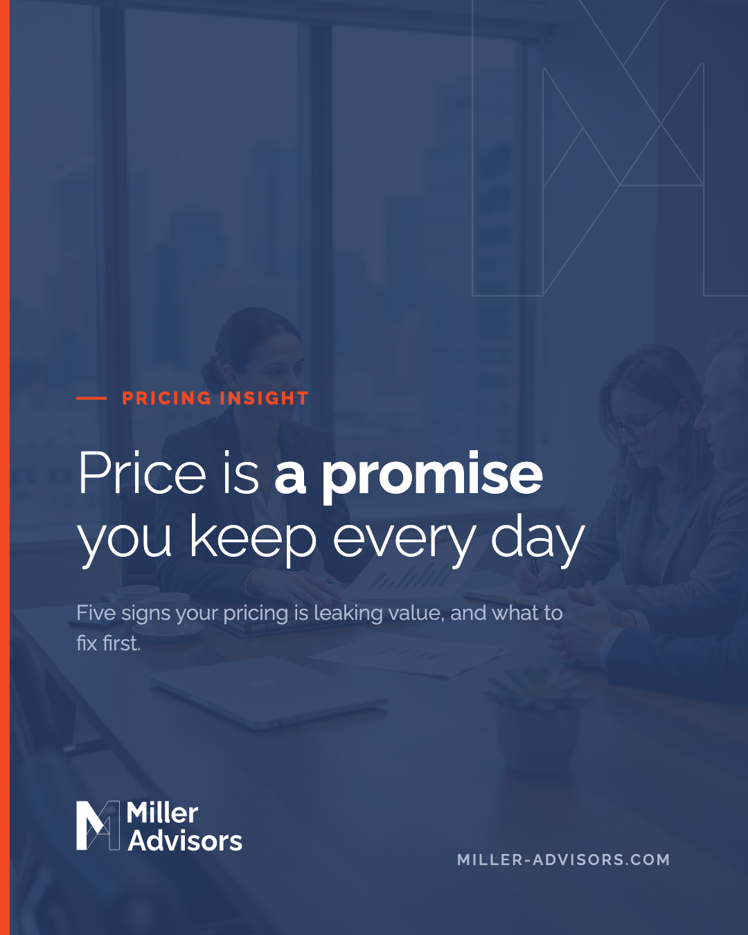
A Miller Advisors social post made from the approved template
Social post, from the template
A Miller Advisors newsletter
Newsletters

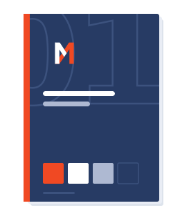
07 · Book and skill

Both deliverables, in full.

These are the documents as they shipped, not screenshots of them. Both were generated from the same source on the same build, which is the argument below made checkable before you read it.

Verbal identity by Clap Clap Creative. ADWORKS redrew the mark and the logotype, chose the colors and the typeface, and built the brand system, the brand kit and the brand skill.

08 · How Miller gets everything

One password. Every file.

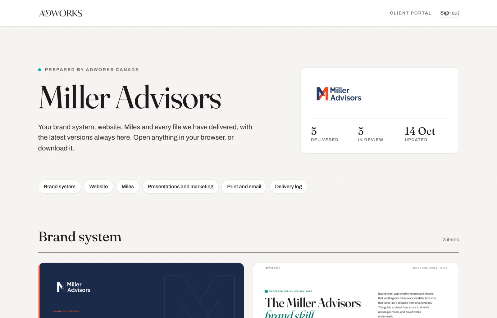
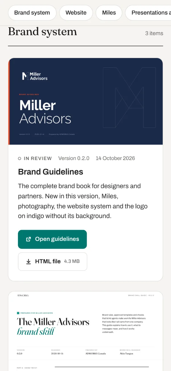
Miller Advisors does not receive any of this as an email attachment. These two documents, the AI brand skill, every logo, the website, Miles the mascot, the company deck, newsletters, signatures and business card press files all live in one private portal. Their team logs in when they need something, and shares the password with whoever else does.

Miller Advisors' client portal with every deliverable, each with a preview and a download button
They switch AI tools.

They download the brand skill again. The new agent follows the same rules.

A new designer joins.

They get the password. The Brand Guidelines are waiting.

The printer needs the cards.

The press files are one click away. No one has to dig through old emails.

We ship an update.

The portal shows the new version and the date. The log records what changed.

Every ADWORKS client gets one.

The portal comes with every project, in your name and with your files. It is how we hand over the work, and how you keep it.

The thinking behind the brand skill

Their guidelines said the orange was for accents. A person reads that and understands. An agent reads it and asks how much orange counts as an accent. So we wrote the rule as a number, put a script behind it, and made the document a person reads and the file an agent loads come out of the same source.

The problem with a beautiful PDF

Brand guidelines were invented for an audience that could be trusted to use judgment. You wrote "generous white space" and a designer knew what you meant. That assumption held for fifty years.

It stops holding the moment the person making a slide at 11pm is not a designer, and the thing making the slide is not a person. An agent cannot infer. It will either find a rule it can act on, or it will invent one, and the invented one will look almost right, which is worse than looking wrong.

Miller Advisors came to us with a verbal identity and a pixelated mark in colors that did not work for them. We redrew the mark as a vector, rebuilt the logotype, and gave the brand new colors and a new typeface. Then came the real work built on top of it: decks, email signatures, newsletters, business cards, a website. Every new piece was another chance for the system to drift a little.

One source, two deliverables

The fix was not a better PDF. It was to stop writing the rules twice.

Every value in the Miller Advisors system now lives in one source file. From it we generate two things: a brand book a designer reads, and a brand skill an AI agent loads. Same colors, same limits, same refusals, because they come from the same place. When the source changes, both change in the same build. They cannot drift apart, because there is nothing to drift from.

The skill ships in the Agent Skills format, as a folder of plain Markdown and JSON with small Python scripts beside it. It runs in Claude Code and in any agent that supports the format. Nothing is compiled and nothing phones home.

What is in the package

  • 16logo masters, placed only, never redrawn or recolored
  • 16approved colors, with contrast computed rather than typed
  • 8two color icons on one 512 grid, orange on the part that carries the meaning
  • 1tiling pattern built from the monogram, in three colorways
  • 2press ready business card PDFs, CMYK with spot separations
  • 2fillable templates: an approved email signature and a social post still in draft

Raleway carries the whole system, bundled under the SIL Open Font License with its license file, so the client can redistribute it without asking anyone. The typeface check names the fallback it used rather than substituting one quietly.

Rules that refuse

The interesting part of a brand skill is not what it makes. It is what it declines to make.

Ask it to turn the logo red for a holiday card and it does not. It explains that the logo is only ever placed from the master files, lists the approved versions, and gives you the agency's contact. Ask for a signature whose name is too long for the approved layout and it shrinks the text to the minimum the designer set, then tells you it did. Go past that minimum and it stops, and no file is written.

Those messages are fixed wording, not paraphrase, and they appear in the agent's reply rather than printed on the artwork. Two levels only: a note means it went ahead and here is what changed, a stop means it did not and here is why.

Where no template exists yet, for a poster or a flyer, it builds from the core rules, saves its review notes in a separate file beside the artwork, and recommends a professionally designed template rather than pretending the result is one.

Tested before it shipped

A rule nobody tested is a wish. Every release passes three layers before it leaves the agency.

The package check runs on every build: 19 checks passed, 5 raised warnings, none failed. It recomputes contrast from the hex values instead of trusting the table, confirms every file named in the rules exists, verifies no script in the package can open a network connection including the vendored QR library, and blocks any other studio's contact details from appearing anywhere in the kit.

The behavior tests run scripted requests through a real agent and check the actual output, including that every note and stop came back word for word rather than politely reworded. Eleven of eleven passed on Claude Code running claude-sonnet-5.

The third layer is a human looking at the results, which is the one that cannot be automated and should not be.

A SHA-256 fingerprint of every core file ships with the package. If a rule file is edited outside the agency, the setup check names the changed file, so a modified rule is never mistaken for the approved brand.

What is still open

Version 0.2.0 is the second release, and still not the finished article; the documents say so on their own pages. It added Miles, the approved photography, the website system and the logo on indigo without its background. The social post template is still a draft and marks anything it produces as a preview. Values the client has not confirmed, including two Pantone references, are labelled as unpublished rather than guessed at.

That labelling is the point. A brand system that hides its gaps teaches an agent to fill them.

Let's build something that lasts

Ready to stand out?

Tell us about the brand you're building, whether it's made for the American market or headed beyond it. We'll bring the strategy, the craft and 25 years of judgment.

San Diego, California hello@adworksglobal.com